Investing time, and money, into a side-scrolling (2D) platformer game has always been a gamble for me. My reflexes aren’t what they used to be. If the game is too hard it leads to frustration, if it’s too easy it becomes dull. I decided to take a chance on D3Publisher‘s, and developer DICO’s, 2D action game called Gleamlight based solely on its aesthetics. That being a unique design where everything has a shape formed out of “stained glass”. Many on social media have made direct references to the game being like Hollow Knight. So let’s see if I can shed some “light” on the viability of Gleamlight. This is our Nintendo Switch review of Gleamlight!
“A Game Without UI”
Swipe, swipe, swipe!
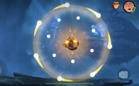
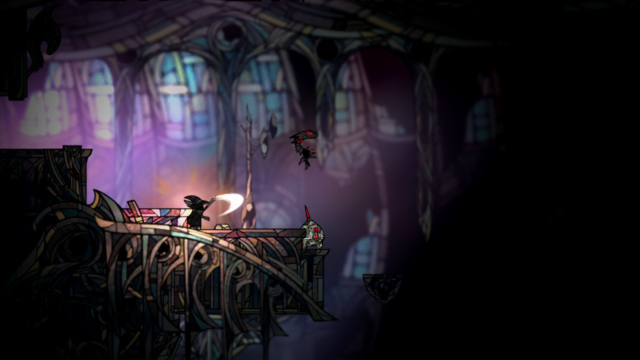
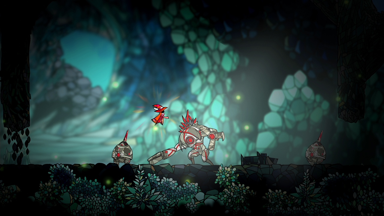
Quite literally there is no backstory here to be told. You start up right into the action. The premise of the game is you’re this little faceless, stained glass mage looking “dude”(?). You jump and run around from platform-to-platform from one darkened level to the next. You use a sword to swipe at stained glass enemies that make a lovely breaking glass sound.
There are no hit counters in Gleamlight. Your life is based on how bright you glow. It takes some detective work but it seems like your life is refilled by hitting things successfully. If your aura grows dark you die. You grow dark by running into enemies, touching red spikes all over the ceilings, walls, and floors. Most level exits are blocked. You unblock them by smashing one or more red “eyes”, for lack of a better word, found somewhere in the current level. Surviving and beating bosses in battle also tend to unlock doors.
K.I.S.S.
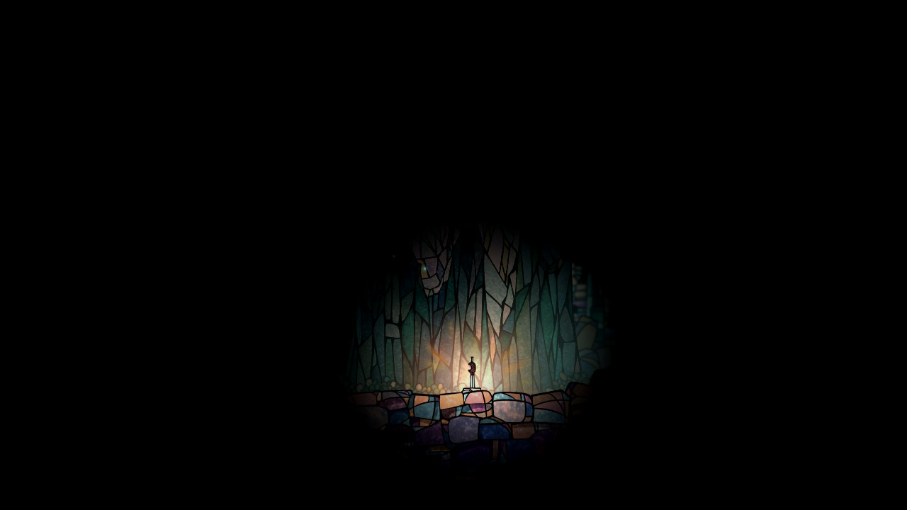
So is the game “loading” or what?
DICO makes it no secret that the design philosophy for Gleamlight was a “keep it simple” approach, in regards to a user interface. It’s literally a “game with no UI”, on purpose. Unfortunately, this approach leads to some of the reasons I got a bit frustrated with the game.
In some cases, it’s not the simplicity of the UI that was frustrating but more so the complete lack of information provided to the end-user. The first example of this was when I started the game. You’re shown a small lite area of the screen (see above screenshot), I assumed the game was “loading”. Since there’s no on-screen cue it took me a while to realize, via trial-and-error, that I needed to hit the “Y” button to proceed. Who’d a thunk, especially since the Nintendo Switch “norm” is hit the “A” button to proceed.
Thanks For Telling Me, Not!
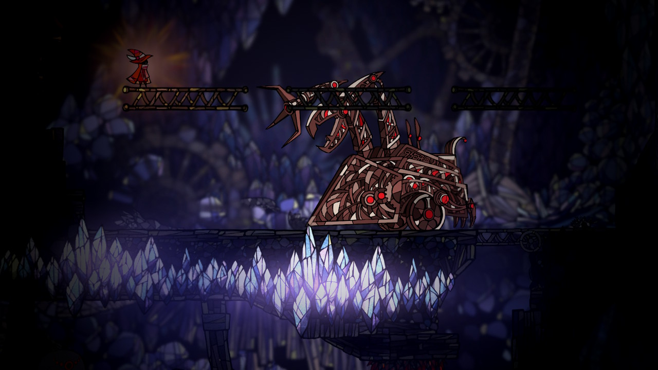
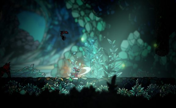
One of the large boss battles in-game.
As you advance in the game you unlock some skills. Early on I noticed on Gleamlight‘s Twitter page there were references to using a “dash” skill. For the life of me, I couldn’t figure out how to trigger this. Through some research, I found it was a skill you unlock later on. It’s also something the game doesn’t tell you when you’ve unlocked it and also fails to tell you how to use it. Such a design decision does not shine a beacon of light on this one! A poor design decision tends to lead to frustration.
The other frustration is the game is dark, intentionally, and your avatar is a “beacon of light”. This design made it hard to figure out what direction to go sometimes as levels play out from left-to-right and top-to-bottom. It was oftentimes hard to tell where platforms were and once you did find them a spikey enemy might all of a sudden appear out of the dark. This is a problem in itself since contact with said enemy, or any section of spikes can cause you to repel backward. The majority of the time it leads to you falling down vertically and a lot of times onto another set spikes. So its two hits for one as they say.
“Simple” Makes It To The Settings As Well
One of the brighter screenshots we’ve seen.
Gleamlight also does not have a remappable control scheme (though D3Publisher says a patch is coming). I found the “L” button to be awkward for the dash mechanic and I would have loved to re-map it to a more comfortable “ZL” button instead.
In conclusion, Gleamlight isn’t the longest of games, just around two hours. For the first hour, you’ll feel the fun, after that it grows a bit repetitive. Especially with nothing like power-ups or collections to pick-up. After a while, it feels quite linear. When all is said and done Hollow Knight probably does “it” better and for a cheaper price.
Note: Our copy was reviewed on the Nintendo Switch with a code provided by PR.
COMPARE TO: Hollow Knight